Composition Principles for Balanced Visual Stories
Composition as a decision-making framework
Composition organizes visual elements so they communicate intention. Rather than adhering to a single rule, composition offers a set of tools: balance, unity, emphasis, rhythm, and scale. Knowing how to use these tools clarifies the image and guides the viewer’s attention.
Balance and weight
Visual balance is about distributing weight across the picture plane. Weight depends on size, value, colour, and detail. A small dark shape can balance a larger light one. As you compose, experiment with moving elements until the arrangement feels stable or intentionally unstable, depending on your aim.
Focal points and emphasis
Decide what should be noticed first and use contrast to achieve it. Contrast can be tonal, chromatic, or textural. A bright colour in an otherwise muted scene or a sharp edge amid soft edges creates emphasis. Ensure the focal point is reinforced by surrounding choices rather than isolated and unsupported.
Rhythm and repetition
Repetition of shapes, lines, or colours creates rhythm. Rhythm can be steady or varied. Use repeated elements to lead the eye through the image. Break the pattern occasionally to create a point of interest; the interruption becomes meaningful because of the established rhythm.
Scale and proportion
Scale establishes relationships between elements and sets a sense of space. Exaggerating scale can convey importance or narrative intention. Keep relative proportions consistent when you want realism; vary them deliberately when you aim for emphasis or abstraction.
Framing and cropping
How you crop a scene changes its narrative. A wider crop situates elements in context; a tighter crop intensifies focus. Try multiple crops of a study to see which framing best supports the story you want to tell. Often a slight shift in cropping strengthens the composition more than adding or removing content.
Negative space as structure
Negative space organizes elements and can create surprising focal relationships. Use empty areas to provide breathing room and to isolate important forms. A confident use of negative space often makes compositions read more clearly.
Thumbnailing and iteration
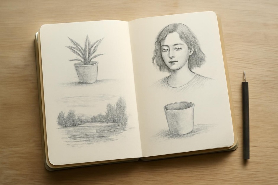
Create several small compositional sketches before committing to a full study. Thumbnails let you test alternatives quickly and reveal the strongest structural idea. Choose the one that solves the central question—what is the primary relationship the image needs to communicate?
Simplify to clarify
Composition benefits from restraint. Reduce clutter, unify colour choices, and simplify shapes to their essential relationships. The clearer the structure, the more effectively the image communicates.
Composition is a practice of choices. Each decision should serve the central intention of the piece. With practice, these choices become more confident and the visual story you aim to tell will emerge with clarity.